Remembering

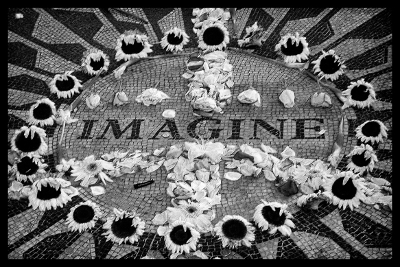
The first time I visited NYC was in November 2001. The city was still grieving, and the dust in the air was so acrid it burned one’s throat. Trinity Church was covered with fliers begging onlookers to call a number if they had seen the face on the flier. The South Tower was partially erect like a broken skeletal remain. The pervasive sadness and sense of loss was palpable, but the pulse of that magnificent city prevailed. There was a unity in visiting NYC and paying one’s respect, not only to the still-smoking Ground Zero, but to New Yorkers. Their resilience and courage in the face of such a devastating event, made any trouble that I was experiencing trivial. Their grief and shock was humbling. I’ve visited NYC several times since 9/11, and it is one of my favorite places. This photo I took shortly after 9/11 in Central Park.

But today, I’m just remembering that terrifying day and all of the courageous souls that lost their lives in such a horrific way. May they rest in peace.

How to Make a StoryBoard/BlogBoard in Photoshop

Have you ever wanted to combine a collage of photos and upload them onto your blog or print them out? Storyboards are essentially photo collages. When I had my photography business, clients always wanted to purchase them as they are visually appealing. They are becoming more prevalent on blogs as you can add a lot of photos to a “board.” I like using them on a blog as it makes the blog space clean and uncluttered. You can make them in Adobe Lightroom, Photoshop Elements, or any version of Photoshop. You can design several and save them as PSD (Photoshop) files, then just drag and drop the photos onto the PSD.

I will be using Photoshop but you can alter these instructions to the software you are using. Open up Photoshop, click File >New and a pop-up window will ask you for the title, dimensions, and resolution of your document. I type in StoryBoard (if I am using 300 dpi) or BlogBoard (if I’m using 180 or 240 dpi for my blog.) Type in the dimensions you want for your storyboard; it can be large, say 11″ or 16″ x 14″ or 20″, but for this exercise and for the web, I made it 7″ x 9″. Another useful size is the good ole’ 8″ x 10″. Type in the resolution and click OK. I kept the background color white but you can change it to any color you prefer.
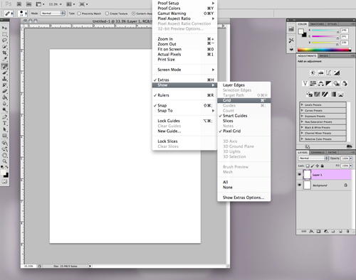


Duplicate the layer by holding Command C (Mac) or Control C (PC), go to the top menu, select View, then Grid. This will make it easier to design the board. Also under View and Grid, be sure Smart Guides is selected. At the bottom of the Layers panel, click on the second icon on the bottom right (to the left of the trash can) and select Create New Layer. Then select the Marquee tool on the left side toolbar panel. Click onto the grid layer and make a square or rectangle. After you have made your shape, select the Paint Bucket (under the Gradient tool on the toolbar panel) or hit ‘G’ to bring up that particular toolset. Select your fill color; I chose black but again, it’s a matter of preference.
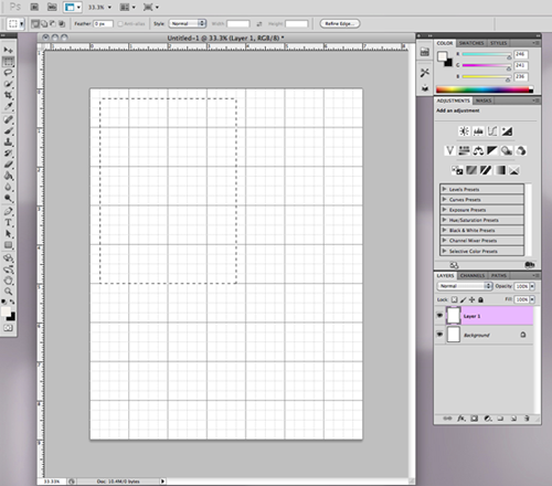


After you have filled the shape, continue to use the marquee tool and paint bucket to create all of your board shapes. The Smart Guide will be a pink line to show you how you are lining up to the previously created shapes. Once your storyboard is finished, go to View and turn off the grid. At this point, I save my board as a PSD file so I can edit it or continue to use it repeatedly. Select the top arrow of the toolbar panel (the Move tool), and select the layer into which you want to insert a photo.
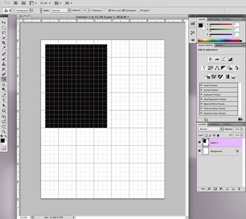
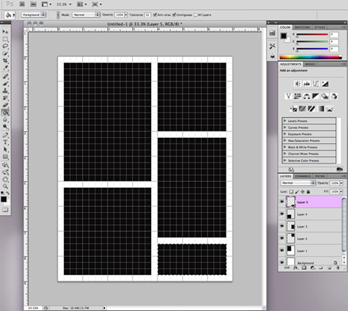


Using the Move arrow, drag and drop your photo onto the layer. You will see a cross on your photo which means your photo is now a Smart Object. Holding the Shift key down, click on a corner square and resize your photo into the black space, using the Smart Guides to help visualize placement. Holding the shift key down while you resize allows your photo to be kept proportional. When the placement is correct, hit the Return/Enter key to commit the photo to the layer. Continue to do this for all the photos in your collage.
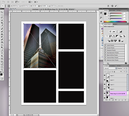


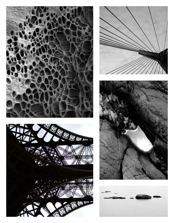
Once all of your photos are in the storyboard, go to the top menu, select Layer and then Flatten Layers. Save your storyboard in the file type you want. I use JPEG or PNG. You can make a board that is just squares, or make a diptych or triptych. It’s very versatile. I find that the PNG loads faster on WordPress.

Voilà! Really simple to do and you can achieve some elegant results.
Dallas

I visited Dallas, TX, for the first time last week. It looks like a move will be imminent early next year as my husband’s company is located there. I really didn’t know what to expect, aside from the mental images of ranches and skyscrapers from the opening of the ’80’s show Dallas. Well, Dallas more than exceeded all my expectations.

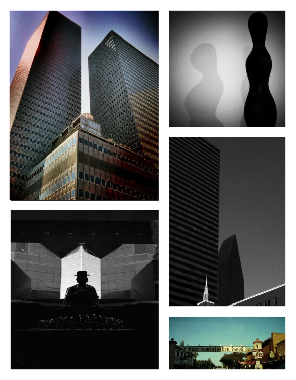
It was vibrant, hot, clean, trendy, arty, did I mention hot? It was 109 degrees but this former Maine girl has acclimated to the intense summer heat, thanks to Tucson. I rode the Dart, the light rail system, as the traffic is epic. Dallas reminds me of a Southwest Boston. I visited the Dallas Museum of Art, the Holocaust Museum, the Kimball Museum, and the Crow Museum for Asian Art. There are trees and water, and I really miss both. I think I could be quite happy there. Beautiful city, very friendly people. I recently watched a documentary on the architect I.M. Pei titled I.M.Pei, First Person Singular. It’s available on Netflix. Excellent film and delves into his creative process. He has designed five buildings in Dallas, the two most famous are the Meyerson Symphony and Fountain Place. Fountain Place is the pyramidal building in the second right photo below. It changes shapes continuously as you walk around it, much like an optical illusion.

This is a photo storyboard I made with some of the iPhone photos that I took during my visit. Tomorrow I will post a tutorial on how to make a photo storyboard or blogboard in Photoshop. It’s a great way to showcase your photos.

How to Make a DIY Brush Stylus (Video)

I recently came across the Nomad brush stylus for the iPad. I’ve been using it with several of the painting apps on my iPad, namely ZenBrush, ArtRage, ArtStudio, and Procreate. What I love about a brush stylus is the feeling of actual painting and the responsiveness with the apps. The Nomad brush tip is a bit too long for the iPhone. I was trying to think of a way to make one for my iPhone and had heard about metallic embroidery floss being conductive on the iDevice touchscreen. I thought about using the skein of embroidery floss and cutting one end to use as a brush and wrapping the skein with masking tape for support. I tried it and it worked.

Two weeks later, I was using ZenBrush and visited their website. Under ‘Extras’ was a tutorial on how to make a brush stylus using the metallic embroidery floss! There really is nothing new under the sun.

I prefer the heat-shrinking electrical tubing but masking or electrical tape without the tubing works fine as well. I made a video tutorial for those visual learners like myself. The stylus is really easy to make and I love using it on my iPhone, the small tip is perfect. I recycled an old Pogo stylus and the smaller barrel is much easier to control rather than the pencil extender but it’s a matter of personal preference. Please be sure you have a screen protector on your iDevice before using the stylus. Im not sure if the floss would produce scratches on the touchscreen over time.

Here is the video. Have fun!

Teahouse and an iPhone


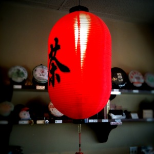
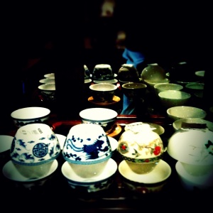
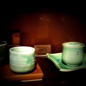
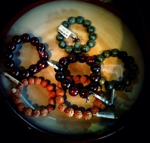
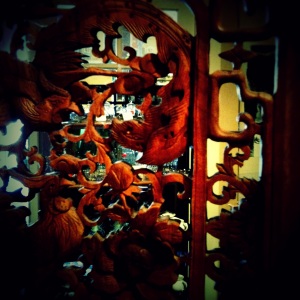
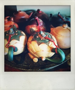
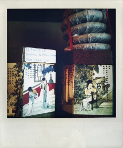
The days are hot and humid here in Tucson as the monsoon season is underway in the desert. There is no greater perfume than the creosote bush whose scent permeates the air after a rainstorm. There is another oasis for desert-dwellers to soothe the effects of the harsh summer. Seven Cups teahouse is a small but mighty and instantly transports you into a cocoon of calm the moment you enter. My friend Mabel asked me to meet her for tea yesterday. Instead of my usual puer tea I choose a pot of this tea. Luckily I made it back home before the thunderstorms began. Thanks M! Photos were taken with iPhone 3GS using Iris Photo, Filterstorm, Camera +, and TiltShiftGen. Rumor has it the iPhone 5 with an 8 megapixel camera will be hitting the stores in September, can’t wait.


Pére Lachaise and Nik SilverEfex Pro


Awhile ago I began using Nik software Silver Efex Pro to convert my black and white images. I was using Photoshop for conversions and was never really quite happy with the results. Perhaps because I love working in the darkroom, I always compare analog with digital. There is a richness and depth to the blacks of a silver gelatin print that I am always trying to replicate with digital. I have had to relinquish working in the darkroom as it’s pretty impossible to keep chemistry the right temperature in an Arizona summer. So digital it is.

I think Nik has done a superb job with their conversion software. Silver Efex Pro (the current version is Silver Efex Pro 2) offers more local and global control with your photographs. The software allows you to determine a control point and make adjustments to a selected area of your photograph. No more laborious masking then burning and dodging in Photoshop. Several well-placed click and sliders and you’re done. It also offers different toning colors and film choices. There is a free trial you can download to try it out, and no, I’m not affiliated with Nik but I really like their software and their iPad photo-editing app, Snapseed.

I had the good fortune of taking a darkroom workshop with John Sexton a few years ago. One of my classmates lives in Paris and brought in a black and white photograph of a beautiful grave statuary that he took in Pére Lachaise cemetery. That image haunted me (no pun intended) for years. I visited Pére Lachaise a couple of years ago and searched that giant necropolis until the guard led me out at closing time. I think I saw every grave there except the one for which I was searching. Finally, through a Google search I found that the grave and statue belonged to a mural painter, Paul Baudry. Two of his colleagues had an elaborate monument made for his gravesite.

It was the first grave I visited when I returned to Pére Lachaise last March. Perhaps it appeals to my soul as the woman with the artist palette appears to be lamenting the work that never becomes realized. I’m happy I don’t have to obsess any longer trying to locate her.

This is the color image:

And after applying some quick effects in SilverEfex Pro 2:


I usually tone my darkroom prints with selenium to cool my shadows, and the software has three variations of a selenium tone effect. I have yet to try a duotone with the software but that’s my next experiment: a copper-blue duotone that’s so difficult to achieve in the darkroom. I will post images if successful.


How To Make HDR Photos on an iPhone

There are a lot of complicated lighting situations in photography. Some photographers deal with it by using artificial light such as strobes or on-camera flash but there is also HDR. HDR means High Dynamic Range and allows you to have a perfectly exposed photograph. If you are using a digital SLR then you can take 3-10 photographs of a scene then use tone mapping and merge them into one fabulous photograph using Photomatix or Photoshop CS5. The effect can be very useful especially for interiors or dusk photographs. Unfortunately, some photographers have used the effect to the extreme and the images look ridiculously fake. But used judiciously, the effect can be quite useful and prevent the trashing of some decent photographs.

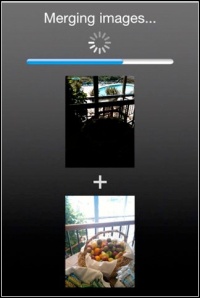
The iPhone 4 has an HDR function but since I have the iPhone 3GS (I’m impatiently waiting for the iPhone 5) I rely on a great inexpensive app called ProHDR. It’s very simple to use and it is also available in an Android version. You launch the app, and the screen will offer you the choice of manual, auto, or library (load from the camera roll) HDR. I like to use manual setting for more control. Once you choose the manual setting, the app opens the camera and will ask you to tap on a bright area of the scene. It takes a photo and you can accept it or cancel, when you accept, it then asks you to tap a dark area of the scene. It then will merge both images together and you can adjust the brightness and contrast of the image. ProHDR can produce a halo effect if you’re too aggressive with the adjustments, so I just pump up the contrast a little and that usually is sufficient.


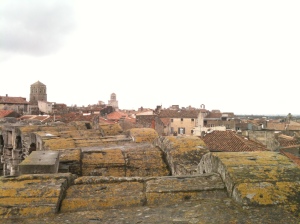
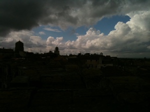
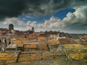
Here are two photographs that I took in Arles, France on top of the coliseum. It was an overcast day without a lot of light. If I exposed for the sky the foreground would have been far too dark and if I exposed for the foreground my sky would have been blown out. With a DSLR I would have taken 5 or 6 bracketed images with the camera on a tripod. These images were handheld with the iPhone using ProHDR and no schlepping heavy equipment up slippery medieval stone stairs.


The final merged and adjusted image


It’s worth the $1.99 and there are quite a few HDR apps in the AppStore. I really like this one and Dynamic Light. After you process your image you can bring it into any editor (Photogene, Filterstorm, PhotoForge, or the free Adobe PS Express) and sharpen the image.

Street Graffiti

I spent a lot of time taking photographs of the incredible French street graffiti. In some cases, instant abstract art. Most of the tagging I noticed was on abandoned buildings in Montmarte or in the more run-down parts of the city. Perhaps because I’m no longer twenty but Paris is one place I feel completely safe in wandering. The graffiti was so multi-layered that I was totally fascinated by the varied compositions. It’s always been there but my eyes finally saw them.

This last one I found on a wall in St.Remy,the town where Van Gogh recuperated after his ear incident. There is something so appealing and ephemeral about the drawing being glued onto the stucco and peeling away. Such a beautiful drawing to give away to the public.

Cézanne’s Studio

In March I finally had the opportunity to visit Paul Cézanne’s studio located in the provincial town of Aix-en-Provence. He fled to his hometown of Aix when the vitriolic Parisian art critics denounced his work and refused to jury his paintings in the Paris Salon of the 1800’s. Considering how derisive the criticism was, it’s a wonder he retained the courage and desire to paint. The townspeople of Aix even left messages on his doorstep at one point, requesting he leave Aix as he was “dishonoring” the town.

Now you can’t walk one block without seeing a restaurant or shop with his name on it. There are even bronze ‘C’s on the sidewalk to walk in his footsteps. Cézanne is big business for Aix now.

I must admit, I didn’t fully appreciate Cézanne’s work until I had to copy his still-life paintings in college. I then began to understand the varied perspectives in his work and the humble beginnings of cubist thought. Think of it. If Georges Braque had not studied Cézanne’s paintings while sharing a studio with Picasso, Cubism may have had quite a delayed start. I personally like the fact Cézanne isolated himself in Provence and painted what he wanted to, not pandering to the desires of critics and the fickle public.

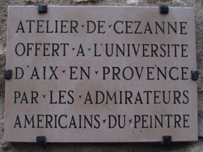
Cézanne built his studio on the Chemin des Lauves in 1902. When he died in 1906, his son inherited the building and subsequently sold it to Marcel Provence. Provence wanted to preserve Cézanne’s heritage and when he died in 1951, the studio was going to be razed by developers. Two Americans, James Lord and John Rewald created the “Cézanne Memorial Committee” and 114 American donors contributed a total of 7,500,000 francs to save the studio. I don’t understand why the French government didn’t intervene. In fact, there are only two Cézanne paintings in all of Aix, at the Musée Granet.

Before my husband and I climbed the stairs to the dusty but well-preserved studio we were told photographs were strictly forbidden. Why? I have no idea save for the fact the city of Aix (which nows owns the studio) wants to make a profit on the poor quality studio postcards in the gift shop. The studio is large with two huge picture windows and Cézanne’s objets d’art that he used for his many still-lifes are strewn around the room. One of the enormous windows used to have an unobstructed view of Mont Sainte Victoire but tall gnarly trees now surround the studio. The room is very carefully arranged to make you think Cézanne has left to paint plein-air and will return at any time. Eerie but effective.

Before I left the room I detected his painting smocks in a small corner. Yes, the Master’s clothing replete with thick splotches of oil paint. I then did what any entitled American would do when they feel their countrymen saved a foreign national treasure. I shut the volume off of my iPhone, opened up the Sneaky Pix app and furtively snapped a couple of photographs. Sneaky Pix makes it look like you are talking on the phone with a fake call screen but it snaps photos while you are pretending to talk on the phone.

After purchasing some over-priced souvenirs in the gift shop, we walked around the lush grounds. I thought how fortunate it was that two Americans took the initiative to save this piece of art history. Hopefully, he wouldn’t have minded my sneaky photos.